Reversing content order on mobile
MailDeveloper now has enhanced controls for reversing content order in mobile layouts. The desired layout is created utilising mobile-only CSS classes that switch the display-property on an element.
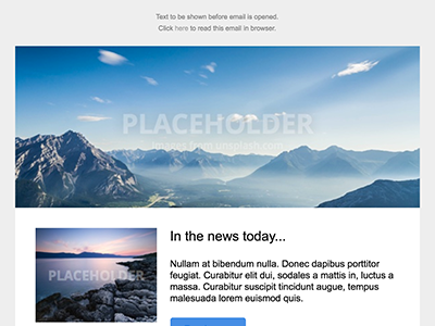
We have also added a new sample template showcasing this feature. Go try it out!
All exported emails now contain the following CSS (read more about default CSS):
@media all and (max-width: 600px) {
    .mobile-display-block { display: block; width: 100%; }
    .mobile-display-none { display: none; }
    .mobile-display-table-caption { display: table-caption !important; }
    .mobile-display-table-header-group { display: table-header-group !important; }
    .mobile-display-table-row { display: table-row !important; }
    .mobile-display-table-footer-group { display: table-footer-group !important; }
}
These display-options make it possible to alter the position of an element in relation to their parent table, as shown in this pen by Action Rocket. The order of elements is this: table-caption, table-header-group, table-row, table-footer-group. This technique works quite reliably in mobile clients where media queries are supported.
These CSS changes are universal, meaning that they will alter the exported HTML even if none of the new features are taken into use on an older template.
This update brings with it a lot of smaller improvements all around the editor. For example, you are now able to define a specific amount of differently sized previews, as well as edit the width of the email container.
We keep constantly improving the application and deploy new changes on a daily basis. Follow us on Twitter to keep up to date!
MailDeveloper is an advanced editor for HTML email templates.
Reduce email development time by hours now.
“I wish I could spend more time fixing email rendering issues.”
– No one, ever.